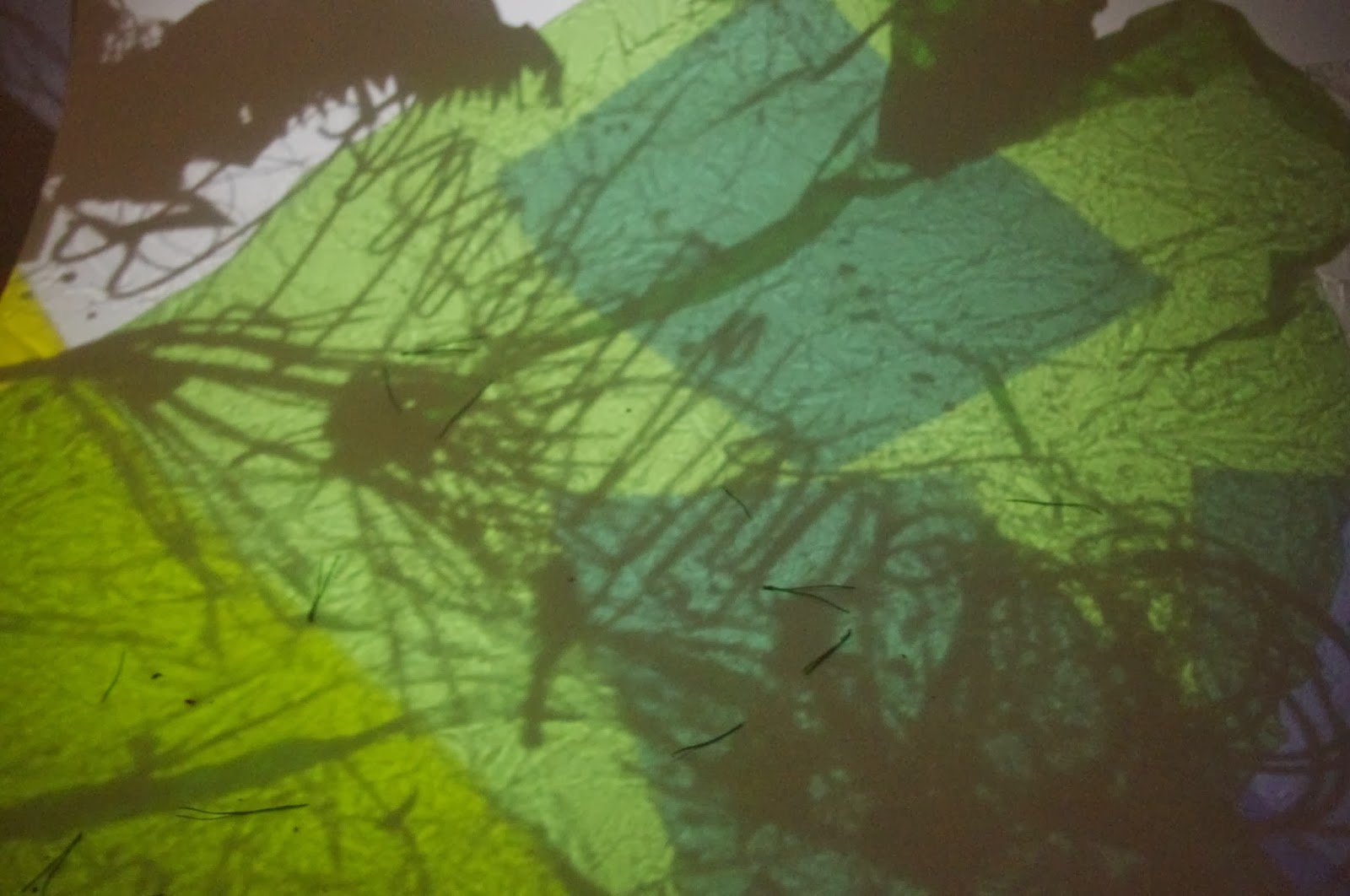
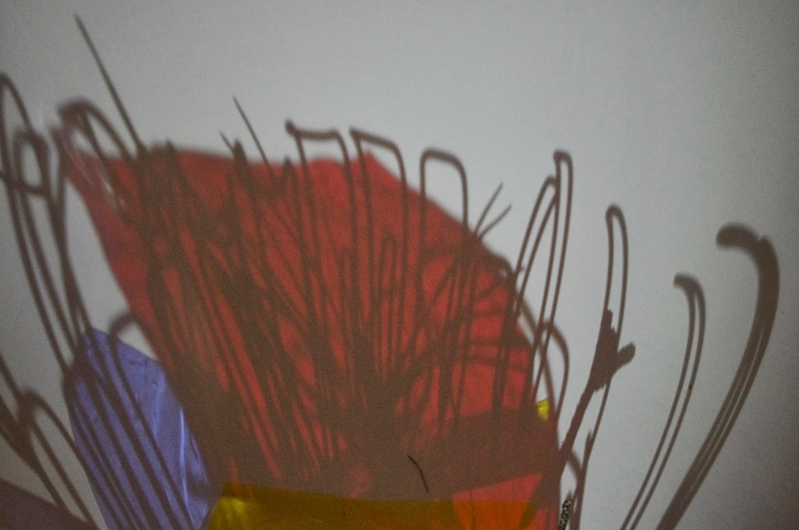
So this was one of the most fun things we did with the girls :) We played around with whatever we could find in the studio, branches,see through paper, a phone, bottle, water, everything we could find!! The results are nice, We can possibly use the pictures for a project or something but it was a great experience :)
Friday, January 10, 2014
Self made typeface
With the help of Natalie Faunch and Sofi Chappers and an iphone flashlight we played around with shadows and reflections, projecting some amazing designs on paper and later photographing them, these are samples of them. I decided to use one of these background for my typeface because I found them geometrically really interesting and would give my typeface life.
So, I started playing around with the backgrounds and my quote, which clearly says :" In reality the universe has no geometry ", and I had to decide which one to go with, some looked better on A4 print and when printed in bigger size they lost the quality. Unfortunately, I could not use any vibrant backgrounds because my typeface wasnt clear and showing off detail when was applied on them. So I had to choose either a really dark background or a really light one.
This is my final print for my A2 typeface editorial. The background I choose hopefully is appropriate to the quote. This was a picture taken with the reflection of a water bottle on a white paper background and later edited on photoshop. I am pretty happy with my outcome. The worst part was cutting out the letter forms and finding a style.
Book jacket design
Veni, Vedi, Vici book cover re-design. This was my final book cover idea, then had to apply it to an actual hard cover wasn't that much fun ;p
This was the initial idea for Veni, Vedi, Vici but I' ve found that it didn't work as well as the final book cover.
My first attempt for The hundred year old man who climbed out of the window and disappeared. I later on changed it because I didnt find the colours appropriate to the content of the book.
My final book cover idea was this one, quite jollie and happy, very humorous book, it was worth reading it and became my favourite book :)
This was the title page I designed for Veni, Vedi, Vici.
I considered redesigning my book with my original sketches that I later scanned, as a single page it looks fine, using it for a book jacket wasn't as appropriate as I thought it would be, still it was worth trying to make something out of it :)
My book photoshoot :)
Book photoshoot 2 :)
This was my original sketch and idea of the book, I love the sketch, it turns out with a broken hand you free up your mind as well, you dont focus too much so that lets your hand run free, after I got my cast off my drawings returned to my old self :s I will try free my mind again.
Subscribe to:
Posts (Atom)


