Wednesday, October 30, 2013


This is my favicon ideas and colour palette. It is the symbol for a thinking cloud plus the letter a from my logo


This is my logo variety with the chosen colour palette. The picture is not hd unfortunately, I will put better quality images up later on. The origin of the word Haliho comes from my native language which is Hungarian and means Hello in a cute way. I wanted to name it something that sounds fun in English and still has a meaning in Hungarian because I want to represent my website in 3 languages. 


My website enter page ideas (typeface-wise)

Can't decide which one to choose ,keeping in mind the enter typeface... I like the second one more, yet the typeface for enter in the first one is closer to the logo one... help me?


Friday, October 4, 2013

Layout spreads - part1


These are my layout spreads. I scanned them in today
so you can compare to my final ones in part 2.
Part 2 was based on the scale and spirit of these
layouts and tried to keep them same with slight changes.


white space


Small body text - big body text


Picture bleeding
 

 Pattern design with non typographic element


Five collumns - 1 picture
 

Stress on left vs Stress in the middle
 

 Pattern design with typographic element


Big picture vs small picture

Thursday, October 3, 2013

My magazine layout sheets

This was our first project for the year. We are simply creating layout sheet spreads on screen based on collage ones that we previously created with cut outs. The spreads are about our hobbies and mine clearly shows my hobby. Hope you enjoy it!

Wednesday, October 2, 2013

Re-creation of old photo

So this is a really old picture of my mom and my sister somewhere is the 80's.
It was a bit tricky to find out the way to do it, but somehow i managed in the end. Not the best reacreation but I am learning :3

Before


After


My first two pages for project 1 - Layout spreads

Given this project we have to create 4 double spreads for a magazine including our summer project which was hobbies basically. These is 2 of my double spreads, but still not 100% done, need some changes, but they are samples :) Enjoy :3


 Exaggeration of big body text and small text. 


Picture bleeding.

Tuesday, October 1, 2013

So this is part of my work last year. Looks like the rest is saved on other computers unfortunately.
These are some pattern designs I made during our session with Adobe Illustrator.


The IT tasks we have been given for the second semester. I definitely had fun with these!!


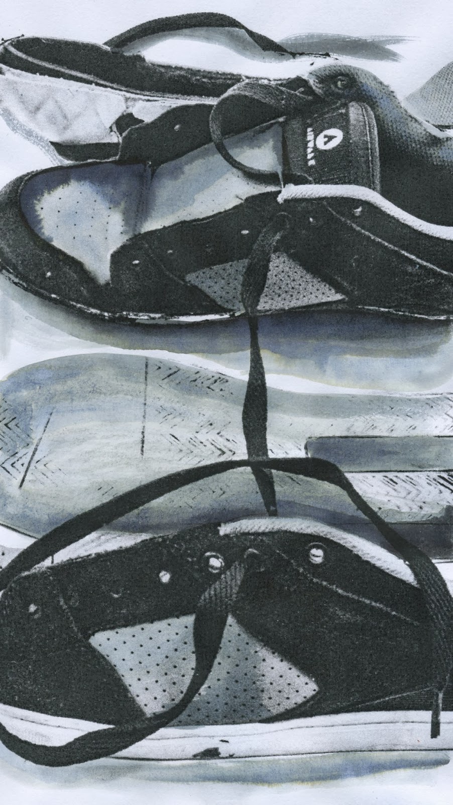
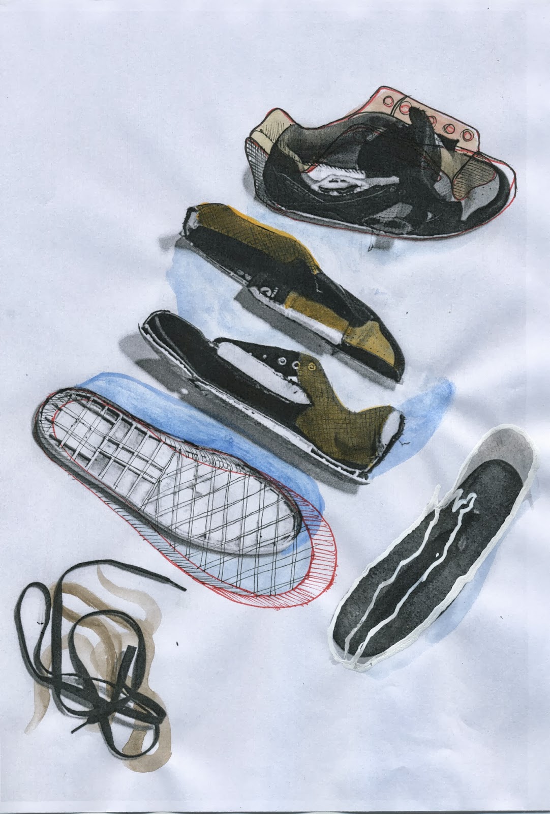
 Part of the shoe project we were doing for Simon's project in Year 1.


The 70's moodboard we created and the game we came up with with my group for our game design project. The pictures below are creations of everyone and not only mine.


The french new wave film clip we created with my class mate Alejandro Bedoya. Was great working with him and creating a weird but fun video. This was our first time videoing and editing films.


These were the posters that were created for the French new wave film we made.


In this task we had to create a cd cover and booklet to represent a song we got from our tutors. This was the last project before Christmas. I think everyone was rushing a bit for the break. :3

Amy Rigby-Dancing with Joey Ramone


We had to create posters on In design using two fonts that were given to us and play with certain details that were given to us as well.


Me and Natalie Faunche's logos for some weird companies.
One of my favorite projects.


Well, this was a part of my last year projects, but this year is going to be exciting, hopefully I wont lose any work and try to post as much as I can here. Bye :3